baychi

Researching Games with Kids

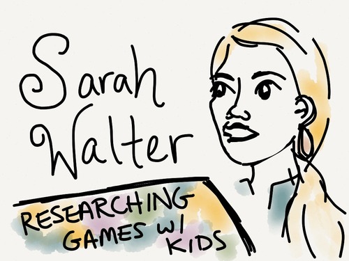
Notes from the BayCHI talk “Please Don’t Face-Plant Into the TV: Researching Games with Kids” given by Sarah Walter, user experience researcher and consultant with a focus on games.

image

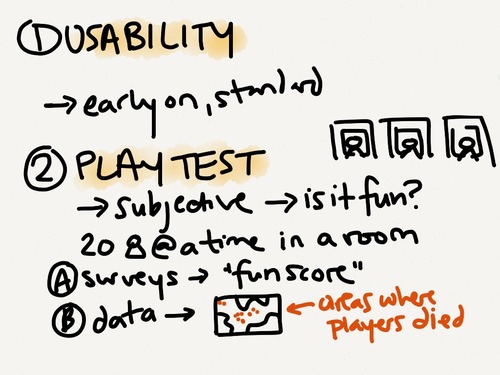
Sarah shared several techniques for conducting user research with children. The first two techniques (usability and playtesting) are fairly standard techniques that are used throughout the games industry.

image

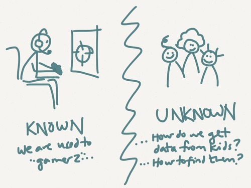
Although these techniques have been long-used for “hardcore gamers”, a target that is well understood, there was much to be learned about designing games for children. How do you know what’s “fun” or “engaging” for a 4 year old who can’t fill out your post-game survey? And how do you even find that 4 year old to play test with?

image

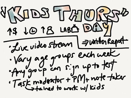
So her team came up with some “kid-friendly” ways to conduct user research for the younger audience:

Bringing kids into the lab on designated days…

image

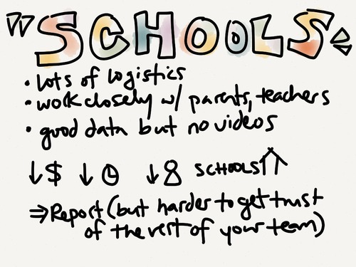
Working directly with schools…

image

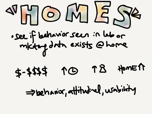
… and visiting families at home.

image

Since this was with children, they had to be extra diligent about explaining who they were, answering any questions, and ensuring a safe environment for their young play testers. 

Designing a UI for 6 Billion People

Notes from a BayCHI talk given by Larry Tesler, the father of the “cut and paste” interaction.

Challenges in designing “cut and paste”:

  1. Unfamiliar metaphor - unfamiliar to anyone not in the copy industry, and for those in the industry the definition was different
  2. User mistakes - they observed that users would make mistakes, such as accidentally leave things in the buffer
  3. Extensibility to other applications - how would it apply to non-text programs such as drawing applications?

Although it wasn’t perfect, they continued to push for it and consider new ways to extend it. They even spent a lot of time dreaming up future possible applications to think about how they might use it later.

Since the first time he thought of cut and paste, it took him 7 years to roll it out.

Other UI paradigms that require exploration and definition: gestures, speech. We’re just at the beginning.

Reflection on Apple: They got so good at understanding their users that the culture moved away from user testing. That’s why some gestures on iOS aren’t necessarily intuitive today– user research is no longer as big a part of their DNA.

Life Learnings

  • Build bug-free, easy to use software
  • Don’t focus on being compatible with a bad UI 
  • Never confuse “busy” with “productive”
  • You don’t have all the answers, so team up
  • If everyone thinks that something is impossible, it’s a great topic for research
  • To fight an uphill battle choose a short hill 

BayCHI: Turning Mediocre Products into Awesome Products (Zurb)

I recently attended a BayCHI talk entitled “Turning mediocre products into awesome products,” led by two members of interaction design consultancy Zurb.

Amidst screenshots, photos, and Star Wars references, Jonathan Smiley & Jeremy Britton told the story of how they designed & launched a new product in 4 months. My notes from the talk follow:

“Design for People”

Design Principles:

  • Small details can change the world
  • Craft matters (you need to be able to design and build it!)
  • Everybody should be able to design - “Can’t draw stick figures? Pick up a yellow pen and highlight something. Can’t pick up a yellow pen? Pick up a red pen and cross something out”
  • You need people
  • Ask “why” five times
  • We love businesses with a long-term view
  • UX design doesn’t exist (as a discipline) since you can only control ½ of the experience; the other person brings their own context to the table

What do you need to make awesome products?

  • Lots of enlightened trial & error
  • Customer feedback ASAP
  • Team behind it - buy-in, want it to succeed

After this talk, challenge yourself to:

  • Design 1 more prototype
  • Demo with 5 more real customers
  • Create 1 more team advocate

The “lone genius” doesn’t exist - everyone’s heard fables of insight happening overnight, but we know that’s false & lots of work goes into every great invention

- ex: the lightbulb

- ex: Steve Jobs (has deep intuition for people, iterates, fails)

Building Verify

Week 1: Sketches

  • multiples -> no ego bruise (don’t feel bad about ones that suck)
  • fast -> in a flow (don’t need to set up anything beforehand)
  • cheap -> easier to repeat
  • disposable -> just a spark (easy to chuck bad stuff)
  • opportunity -> “wow” moments (accidental moments of insight)

Sketching becomes the “requirements” doc - better than a huge doc because they look less intimidating so people respond to them more honestly & productively

Month 1: Prototype

  • Front end code in ~1 week
  • “Spec” - Created a single page that lists out every screen in the app in order to build the app, including thumbnails of what they screens will look like. Divided up by user task. Links directly to the pages.
  • Literally scanned, chopped up, and dropped hand-sketched icons into the app

Month 2: Test Ideas & Iterate

  • presented at “Demo 2010” conference, got lots of excitement & signups
  • shared with users & iterated

Month 3: Private Release & Feedback

  • beta with 200-300 users
  • once people were using & paying for it, feedback came in strong
  • continued to learn user behavior - when added links to more tests at the bottom of the “Thank You” page, they found users would usually take another test because they’d found the last one to be so quick & fun

Month 4: Launch!

Additional Reading Material