usability

Researching Games with Kids

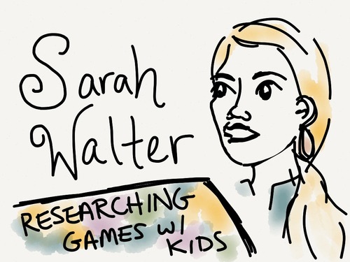
Notes from the BayCHI talk “Please Don’t Face-Plant Into the TV: Researching Games with Kids” given by Sarah Walter, user experience researcher and consultant with a focus on games.

image

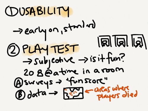
Sarah shared several techniques for conducting user research with children. The first two techniques (usability and playtesting) are fairly standard techniques that are used throughout the games industry.

image

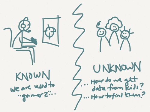
Although these techniques have been long-used for “hardcore gamers”, a target that is well understood, there was much to be learned about designing games for children. How do you know what’s “fun” or “engaging” for a 4 year old who can’t fill out your post-game survey? And how do you even find that 4 year old to play test with?

image

So her team came up with some “kid-friendly” ways to conduct user research for the younger audience:

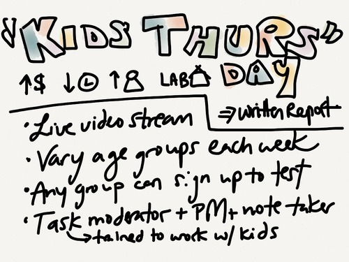
Bringing kids into the lab on designated days…

image

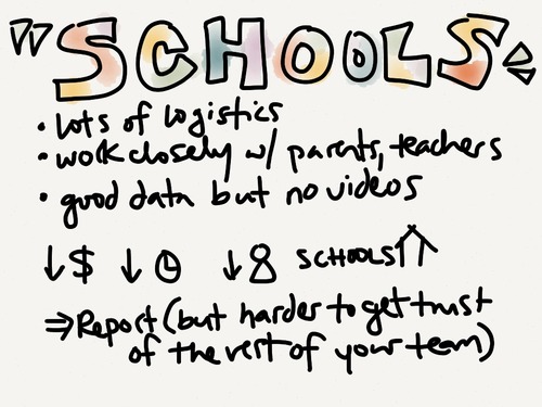
Working directly with schools…

image

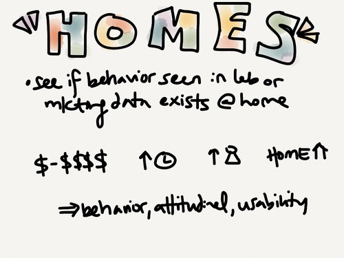
… and visiting families at home.

image

Since this was with children, they had to be extra diligent about explaining who they were, answering any questions, and ensuring a safe environment for their young play testers. 

Five Lessons for Creating Great Tablet Experiences (part 2)

Continued from Part 1 of my notes from a BayCHI talk given by Brennan Browne, a UX researcher at AnswerLabBrennan presented the pros/cons of different techniques used for capturing mobile phone/tablet user research sessions.

Screen Captures (video recording straight off of the device)

Pros: best image quality, portable, cheap

Cons: doesn’t work well with all devices (earlier iPhones can’t use this without jail breaking), doesn’t capture physical interactions w/ device, passwords/sensitive info can’t be hidden

Video (filming the screen)

Tips: 

  • equipment is expensive so consider demos or rentals
  • define a hotzone to the user (ex: put a piece of paper down on the table and ask user to keep the device over it)
  • be aware of room lighting/glare

A. Videographer

Pros: works for any mobile device, can capture physical interactions, flexible and portable

Cons: cost (need to bring an extra person to the session), screen may be difficult to see, may have to ask user to move around, lighting

B. Sled - camera structure that attaches to the device (ex: Noldus)

Pros: fixed, hi-res screen, captures physical interactions, no videographer required, very portable

Cons: won’t work with all devices, limits users ability to switch orientations or use slide out key boards, adds weight to the device, hard for participants to hide passwords or sensitive info

C. Document Camera - looks much like an old overhead projector

Pros: can capture device at any orientation, captures physical interactions, high res camera, no videographer needed, camera itself reminds users where to hold the device, can easily enter passwords/sensitive info by removing device from the recording area

Cons: price (>$7K), screen quality isn’t as good as a screen cap, not well suited for field studies

On a personal note, we’ve tried several of these methods in our iPhone usability studies and I very much prefer Screen Cap over Video. When we used a Noldus camera, we found that users were very hesitant to pick up with the device and interact as they normally would in real life. Instead they’d put the device down on the table and poke at it from afar. When we started running tests using Screen Cap (thanks to iPhone 4S/iPad 2 mirroring), we found that users felt more free to bring the device closer to their face, use gestures outside of “tap”, and rotate into landscape mode. Although we aren’t able to capture the user’s gestures on film, we take notes about interesting/surprising gestures to augment our notes.
Five Lessons for Creating Great Tablet Experiences (part 1)

Part 1 of my notes from a BayCHI talk given by Brennan Browne, a UX researcher at AnswerLab.

Trend 1 - Trading computer time for tablet time

  • Why? It’s more fun, easy, convenient.
  • Computer: in the home office vs. Tablet: comes everywhere
  • Tablets are portable, not necessarily mobile - possibly because need wifi (not all are 3G enabled)
  • Over past 6 months, see trend of more people using tablet at work - more employers are handing them out, there are more biz-related apps available
  • People are afraid of taking iPad outside of home, Starbucks, work, or other places where they feel safe (i.e. not public transit) because they fear theft
  • Choice of device to use isn’t based on where user is– it’s about what user wants to do. 
  • Phone: quickly checking something
  • Tablet: immersive - plan to sit down with for a longer period of time
  • Computer: for tasks that require more management/multitasking/typing
  • People prefer typing on everything (i.e. phone, computer) except a tablet
  • Did see people using bluetooth keyboards primarily if they’re trying to replace their computer with an iPad (although would still often have to turn back to a computer for other reasons)
  • Whichever device is most convenient at the time will often be the one they choose to use. For example, they might pull their phone out of their pocket while on the couch, rather than getting up to grab a computer from another room.

Trend 2: The tablet and shared experiences

  • Tablet is commonly shared amongst family members
  • In the past 3 months more common to have multiple iPads within a house– “I got tired to sharing it so I got everyone in my house one”– much like what happened when computers were growing in popularity
  • Shared nature can lead to some problems because no built in multiuser support in iPad & very limited in Android. Puts the responsibility for multi-account support on the app developer
  • Facebook tries to support this (to view this, sign out of the FB iPad app and see ability to create other accounts)

Trend 3: Apps vs Web

  • Many users are content to use the web on iPad - they expect to be able to access the full version of the website and to have the same level of functionality that they would have from the computer
  • Example of a bad app: Target (users felt they were being forced to leave the app to view product details on the website which broke their experience - “what’s the point of even using the app?”)
  • Example of a good app: Zappos (users get full functionality of the website, plus ability to interact with pictures, better shopping cart experience, etc.)
  • Best Practice: give lightweight help to users during their first use experience, then make help content available (but not in their face) going forward
  • Best Practice: use universal app instead of having a separate iPhone/iPad app if possible or users might not realize that you have a different version of the app in the App Store
  • Best Practice: website interrupts that alert you that an app is available is fine unless it impedes the web experience (ex: people were frustrated by Yelp which asks them to download the app each time they visit the website). Using a banner or sending an email may be even more preferable.
  • People generally update their apps within a month
  • See lots of people syncing their iPads to computer, but it’s not as common as syncing their smartphone
  • Did observe some users saving websites to their home screens, but these were generally more tech-savvy users or those who didn’t care for apps
  • Saw a mix of people who did/didn’t want push notifications. Best Practice: don’t ask users whether they want to accept push notifications until they’ve spent some time within the app and have an idea of how/why notifications might be useful to them

Overall Design Recommendations

1. Design for a “small laptop”, not a “big phone”

  • Create fast, intuitive, full featured experiences that are fun to use and better than the web

2. Full web

  • People expect a full website when browsing on the iPad browser, so ensure your site is optimized to deliver a great experience. 
  • Ex: use HTML5 to customize the keyboard when typing in a datafield

3. Content over context

  • Location-specific experiences that are king on smartphones may not be as important on tablets because they aren’t necessarily being brought everywhere
  • Instead, focus on rich content and superb UI (especially taking advantage of video & photo)

4. Shared device

  • Consider social nature of the device when design log in components, how data is stored, and anything involving transactions/ecommerce
  • Ex: Amazon app allows users to view recommendations/watch list without signing in, but user is prompted for password when making a purchase

5. Security fears

  • People have no clue about security on a tablet. In all of their testing, they’ve never seen someone who’s set up a passcode on the iPad. The people who are the most tech savvy are the least afraid of security risks… but non-savvy users are more afraid about persistent log in and entering credit card info and will sometimes go back to a computer when they’re required to input credit card credentials
  • Tip: reassure users that the privacy/security of your app/website on the iPad are the same as what they’ll find on the computer

In part 2 of this post, I’ll summarize Brennan’s recommendations regarding smartphone/tablet usability testing.

The difference between user interface design and hardware specs is that better usability is derived from one-time expenses for user studies, design iterations, and coding — whereas beefier hardware (say, adding a camera) is a repeated expense for each additional unit manufactured.


This means that even cheap devices can have great usability because the cost of better research and design is amortized across millions of devices. This is why usability has stupendously high ROI for any big project.

— Jakob Nielsen’s Alertbox, “Rebuttal to Critics of Kindle Fire Usability Study”

Logo design for Frankendeal.
A long-overdue update on my Women2.0 Labs experience: three weeks ago, I teamed up with a group of 3 other entrepreneurs. We rallied around the idea of creating a platform for audio-guided walking tours. Many interviews,…

Logo design for Frankendeal.

A long-overdue update on my Women2.0 Labs experience: three weeks ago, I teamed up with a group of 3 other entrepreneurs. We rallied around the idea of creating a platform for audio-guided walking tours. Many interviews, surveys, brainstorms, concept tests, mentoring sessions, and nights at HackerDojo later, we find that our idea has changed quite a bit.

Now we’re hard at work tackling a new problem: how to improve the customer experience of waiting in lines. Our goal is to make it so enjoyable to wait in lines that customers actually look forward to it! We’re exploring the possibility of using location-based mini games to entertain users while providing real-world rewards, such as coupons. Project code name: Frankendeal.

There are still a lot of questions that we need to answer, and problems we’ll need to solve. In the spirit of quick-and-dirty user research, we hung out at a local coffee shop last week, observing & engaging with people as they waited in line. We learned a lot about how people deal with lines– what they do, how they feel, how it affects their overall experience. We also got a lot of great feedback on our idea!

This week, we’re developing a very rough prototype that we can get into users’ hands to gauge actual interest and usage. Our first iteration is very simple and focuses on the following game elements that resonated with users:

  • short duration
  • potential for real-world reward
  • game is somewhat challenging, rather than being “mindless”
  • tied to location (using the foursquare API)

I’ll keep you posted as lightning strikes and brings Frankendeal to life!

Thanks again to all who have helped out by participating in interviews, surveys, usability, and more. You are truly wonderful.

Five Second Test

I just found this little site: www.fivesecondtest.com

Web designers submit images of their site mockups. Users then come to the Five Seconds Test website and select a test to take. The image of your website layout flashes on their screen for 5 seconds, and then the user completes one of the following tasks depending on which type of test they are taking:

  • Classic: users are asked to list things that they remember after viewing your interface
  • Compare: users see two versions of your interface and specify their preference
  • Sentiment: users are asked to list their most and least favorite things about your interface

I took a couple of the tests and found that it was quite fun to be a tester. Maybe that’s just because I really like looking at and analyzing UIs, but the fast paced-nature and simple feedback form makes it rather absorbing. I felt like I wanted to just review website after website, rather than having to keep clicking the “do a random test” button!

Getting users to come to and continue to participate in the tests must be one of FST’s challenges. Without a certain continuous flow of testers, people submitting designs will get little out of the service since this sort of limited feedback really needs to be available in larger amounts in order to gain useful recommendatiosn from it. Although this seems to be a pet project right now, I think this has a lot of potential as a method for quick usability tests & uniting a webdesign community. I’m sure there must be websites out there that are dedicated to users sharing their interfaces and receiving feedback from the community, but the FST feels different because it blends a sense of low commitment with promise of high reward. For quick design iterations, the FST might be all that you need if you’re looking for the impressions of many, rather than the detailed analyzations of a few. It would be great to see the FST creators, mayhem(method), try to build up some community around this, or for an existing online design community to adopt a similar type of test.