mobile

Native vs. Mobile Web, 1 year later

Remember how a year ago everyone was asking “Native or Mobile Web Apps*”? At the time, the pros/cons list looked kind of like this:

Native App: allows device specific strengths (GPS, camera, notifications, etc.) but you have to build a separate app for each device & deal with app store overhead

Mobile Web App: can build one thing that will work across many platforms and you don’t have to deal with app stores, but you lose some device-specific capabilities and there was no clear winner w/ dev frameworks

Since then, the debate has shifted. It’s now generally accepted that when it comes to building apps, native wins.

Here’s what’s changed:

  • The top mobile players have emerged: as people retire their feature phones, they’re upgrading to iPhone, Android, and Windows smartphones. This helps app developers to make safe bets on where to invest their resources, rather than anxiously trying to guess what’s coming next.
  • The “big 3” (Apple, Google, Microsoft) are training users to choose native apps. They all have a clear incentive to do so: when a user downloads an app, guess who makes a cut of the profits?
  • Native apps are widely recognized by users as creating a better user experience:
  • 1. UI elements fit with user’s expectations for the device (I’ve heard many Android users complain about Android apps that look like they were designed for iPhone. Non-tailored experience in mobile web are just as off-putting)

    2. They feel “faster”: native allows you to minimize delays caused by having to download images/content

    3. When users lose internet connection, they can continue with their native app experience in many cases

  • I also loved this point from the good folks at N/Ng:
  • Finally, let’s consider the differences between Nielsen’s Law for Internet bandwidth and Moore’s Law for computer power. Over the next decade, Internet bandwidth will likely become 57 times faster, while computers will become 100 times more powerful

    In other words, the relative advantage of running native code instead of downloading stuff over the Internet will be twice as big in 10 years. One more point in favor of mobile apps.

No one knows what the next 12 months will bring. But for the here and now, “native” wins.

*Throughout this article I am referring to apps, not mobile-optimized websites. It always makes sense to mobile-optimize your website!

The problem with mobile app "Pretenders"

So true:

The iPhone browser already has a back button

This is a great explanation of why mobile web apps shouldn’t simply try to emulate a native app:

Users of pretender apps get an experience that falls squarely in the uncanny valley — it looks like a native app, but something isn’t quite right. Perhaps it doesn’t respond as expected or it doesn’t quite follow the conventions of a native app. Often pretender apps have both of these problems and then some. They simply don’t feel “at home”.

Another problem which we’ve heard in usability: non-iPhone users are put-off when they encounter mobile websites that “look too much like an iPhone”. There are interaction problems: should the Android user tap the glossy button or the hard back button to move to the previous page? There are also visual design problems: when a page screams “designed for iPhone,” non-iPhone users feel like they’re being treated as second-class citizens. Not good, considering that many users consider their choice of phone to be a mode of self-expression.

Recommendation: Focus less on “I’ve fooled them all into thinking this is native!” and more on “This is a great user experience.” A few tips:

  • Keep it clean & quick to load (consider your use of images, animations, etc.)
  • Streamline key workflows: keep in mind that each time the user navigates to another page, they run the risk of encountering slow load times
  • Optimize layout & visual elements to be appropriate for a small screen size (look to native apps for best practices about font size, line height, tap area, etc.)
  • By default redirect users to the mobile-optimized version of your site, but include a link to the full version of the website

HTML5: Perks + Graceful Degradation

From Smashing Magazine, some of the lesser-known delights of HTML5:

  • <a> is a block element
  • placeholder text within forms (I’m very excited about this one!)
  • improved method for defining page sections

My favorite update is that the W3C guidelines dedicates an entire section to compatibility and graceful degradation.

It’s time to celebrate the end of the myth of cross-browser consistency. Adaptive design used to be about designing for IE vs. Firefox and 800x600 vs. 1024x768. But that’s all changed with the new proliferation of devices such as mobile phones, tablets, high resolution monitors, dashboard displays, and web TV.

It’s not longer just the web developer’s challenge to make sure that everything looks exactly the same across all browsers and devices. The designer must work in tandem to ensure that the user experience adapts smoothly across the many devices through which we now live.

Customer Care in Mobile Apps

Some tips from Mashable about customer support in mobile apps:

  • When building an app, acknowledge that some aspect of “traditional care” (support agents, phone help, help documents) may still be needed and plan for them
  • Streamline the experience - app could be used to immediately transfer the users to the right agent or schedule a callback while giving the agent proper context
  • Notifications can be useful for informing users about outages and other problems before they encounter them and have a bad experience
  • Use the info that you know about users of the app (usage history, etc.) to tailor the support experience to them
  • Take advantage of unique mobile capabilities (touch, voice input) to help users find what they need faster

Android Design Guidelines | Mutual Mobile

A set of unofficial Android Design Guidelines from the folks at Mutual Mobile. I found it to be a useful translation of the Android Developer design guidelines into “design speak”.

Useful recommendations include:

  • Dimensions for common UI elements (such as tab bar) across devices
  • When to customize or go with default UI components
  • Things to watch out for when specifying rich visual design
  • How to size & export button/icon assets
  • Using draw9patch
  • … and all sorts of other little hints & tricks for avoiding Android “design disasters”

A Study of Trends in Mobile Design

An excerpt from a Smashing Magazine book about mobile design. Topics are a mix of technical (TLD usage, code validation, load time), visual design (typography, contrast), and interaction design (navigation, link click region, scrolling). Worth reading to get a quick snapshot of mobile design patterns as they exist today.

Intuit Online Payroll app launched

My team’s iPhone app was released on the App Store yesterday!

Working on this project has been a fantastic experience. We packed an incredible amount of user research, design, iteration, development, and QA into just a few months. It’s exciting to finally get something in front of users– we’re itching to hear & respond to their feedback! We’re also working on several enhancements and new features that will be added over the coming months.

The app allows users to run payroll, view their last payroll run, and look up employee information. Note: you must have an Intuit Online Payroll or Intuit QuickBooks Payroll for Mac account to use it.

Logo design for Frankendeal.
A long-overdue update on my Women2.0 Labs experience: three weeks ago, I teamed up with a group of 3 other entrepreneurs. We rallied around the idea of creating a platform for audio-guided walking tours. Many interviews,…

Logo design for Frankendeal.

A long-overdue update on my Women2.0 Labs experience: three weeks ago, I teamed up with a group of 3 other entrepreneurs. We rallied around the idea of creating a platform for audio-guided walking tours. Many interviews, surveys, brainstorms, concept tests, mentoring sessions, and nights at HackerDojo later, we find that our idea has changed quite a bit.

Now we’re hard at work tackling a new problem: how to improve the customer experience of waiting in lines. Our goal is to make it so enjoyable to wait in lines that customers actually look forward to it! We’re exploring the possibility of using location-based mini games to entertain users while providing real-world rewards, such as coupons. Project code name: Frankendeal.

There are still a lot of questions that we need to answer, and problems we’ll need to solve. In the spirit of quick-and-dirty user research, we hung out at a local coffee shop last week, observing & engaging with people as they waited in line. We learned a lot about how people deal with lines– what they do, how they feel, how it affects their overall experience. We also got a lot of great feedback on our idea!

This week, we’re developing a very rough prototype that we can get into users’ hands to gauge actual interest and usage. Our first iteration is very simple and focuses on the following game elements that resonated with users:

  • short duration
  • potential for real-world reward
  • game is somewhat challenging, rather than being “mindless”
  • tied to location (using the foursquare API)

I’ll keep you posted as lightning strikes and brings Frankendeal to life!

Thanks again to all who have helped out by participating in interviews, surveys, usability, and more. You are truly wonderful.

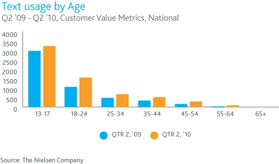
The Average Teenager Sends 3,339 Texts Per Month
Also interesting:

Texting is also supplanting voice calls — 22% say SMS is easier than a  phone call and another 20% say it’s faster.  Voice usage has decreased  by 14% among teens and is decreasing …

The Average Teenager Sends 3,339 Texts Per Month

Also interesting:

Texting is also supplanting voice calls — 22% say SMS is easier than a phone call and another 20% say it’s faster. Voice usage has decreased by 14% among teens and is decreasing in all age groups under 55. Eighteen- to 24-year-olds use the most minutes, but every age group between 18 and 55 talks on the phone more than the average teenager.

A Badge That Tells Consumers, 'Trust This App' - NYTimes.com

TRUSTe Badges - another way to increase user confidence in mobile websites & apps. Good to hear that they’ve tailored it towards mobile-specific privacy concerns (location info, accessing contacts/calendars, etc.).

The badges will be big enough to see on a mobile phone and if cellphone owners click on them, they can read more information about how the site or app handles personal information. If they click on it again they can lodge a complaint with TRUSTe.