html5

Awesome Web Typography @SXSW

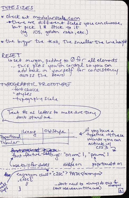
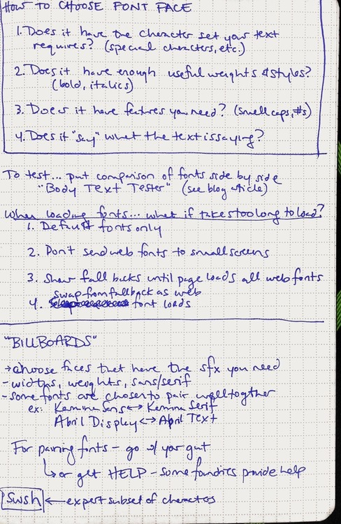
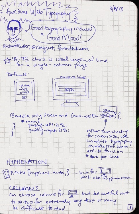
Richard Rutter of fontdeck.com taught a class about web typography at SXSW'13He showed us some great examples of when and how to tweak your typography with HTML and CSS.

A few things I learned:

  • adjusting auto-hyphenation
  • responsive web design - adjusting for line length, line breaks, etc. when on different sized screens
  • how to handle multiple columns
  • proportional/tabular/lining/old style
  • how to choose font faces for the web
  • options for loading custom fonts so that the experience is good even on slow internet connections

My notes:
image

image

image

HTML5: Perks + Graceful Degradation

From Smashing Magazine, some of the lesser-known delights of HTML5:

  • <a> is a block element
  • placeholder text within forms (I’m very excited about this one!)
  • improved method for defining page sections

My favorite update is that the W3C guidelines dedicates an entire section to compatibility and graceful degradation.

It’s time to celebrate the end of the myth of cross-browser consistency. Adaptive design used to be about designing for IE vs. Firefox and 800x600 vs. 1024x768. But that’s all changed with the new proliferation of devices such as mobile phones, tablets, high resolution monitors, dashboard displays, and web TV.

It’s not longer just the web developer’s challenge to make sure that everything looks exactly the same across all browsers and devices. The designer must work in tandem to ensure that the user experience adapts smoothly across the many devices through which we now live.